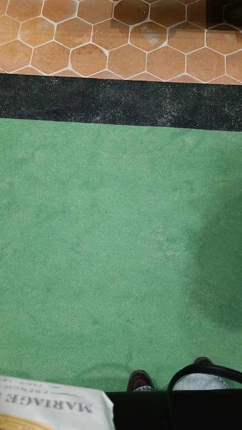
In the Paris Army Museum, Musée de l'Armée, conveniently located in the magnificent building of the Invalides (Les Invalides), near the tomb of Napoleon Bonaparte, a retrospective exhibition of the French Resistance Movement has opened. The carpets that are spread along the corridors of this exhibition have a striking electric green color, a bit unnatural, and at the same time very specific, so that you can't help but wonder why that shade of green.
Here's what shade it is:
But when you look carefully at the exhibits, you will find two interesting medals:
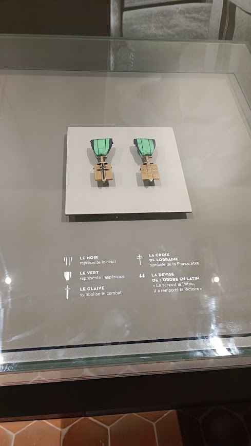
- ⬛ BLACK COLOR ( Le Noir ): On the edges of the ribbon, it symbolizes sadness and mourning for the occupied and suffering homeland.
- 🟩 GREEN COLOR ( Le Vert ): The dominant color on the tape that represents hope for final victory and liberation.
- 🗡️ SWORD / GLORIFIED SWORD ( Le Glaive ): Which is in the very core of the bronze shield (effigy), symbolizes military struggle and resistance .
- ➕ CROSS OF LORRAINE ( La Croix de Lorraine ): Stamped over the sword, it represents the official historical emblem and symbol of Free France under the leadership of De Gaulle.
- 📜 LATIN MOTTO ( La devise en latin ): On the back of the medal is the motto ” Patriam servando, victoriam tulit” , which translates to: “Serving the homeland, he won victory”.
The green color, that special shade of the carpets is not accidental, it is part of the museum's exhibition concept, and it is about the shade of Parisian green , le vert de Paris Although it is certainly not that color on the carpets, it is the most similar to the synthetic color discovered in 1814. It was synthesized by the German dye manufacturers Wilhelm Sattler and Friedrich Russ. It contained arsenic and copper, by composition it is copper (II) acetate triarsenite, and yes, it was poisonous, so it was used as an insecticide and a means of killing rats, especially in the sewers of Paris, if we may mention these not at all romantic uses. It was precisely because of this widespread use in Paris that it got this name, which we consider romantic today. By the way, transition metals like copper often have some color, and copper compounds usually vary between greenish and blue-turquoise hues.
This is the closest shade to the one on the medals, although it is never actually stated that this shade is on the medals. Later versions of this order had a slightly darker, warmer and softer green, closer to olive. The color of the order itself is green, which symbolizes hope and the rebirth of the homeland, and the artistic pigment that Paris was known for in the 19th century was not used to color the ribbon of the order, but it has that specific shade of jade green or, as others call it, emerald green.
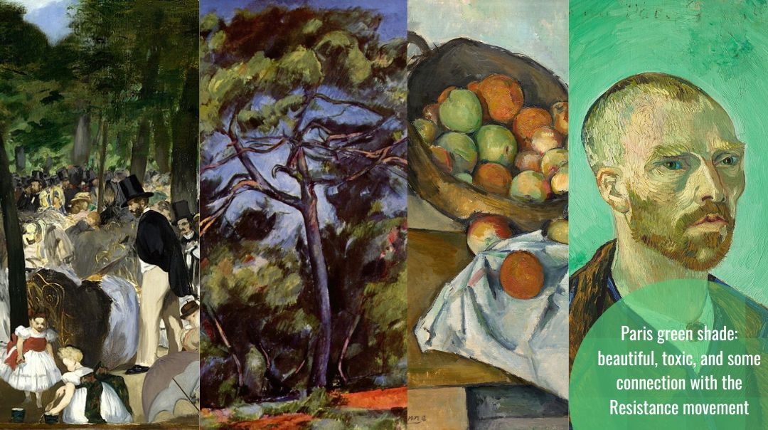
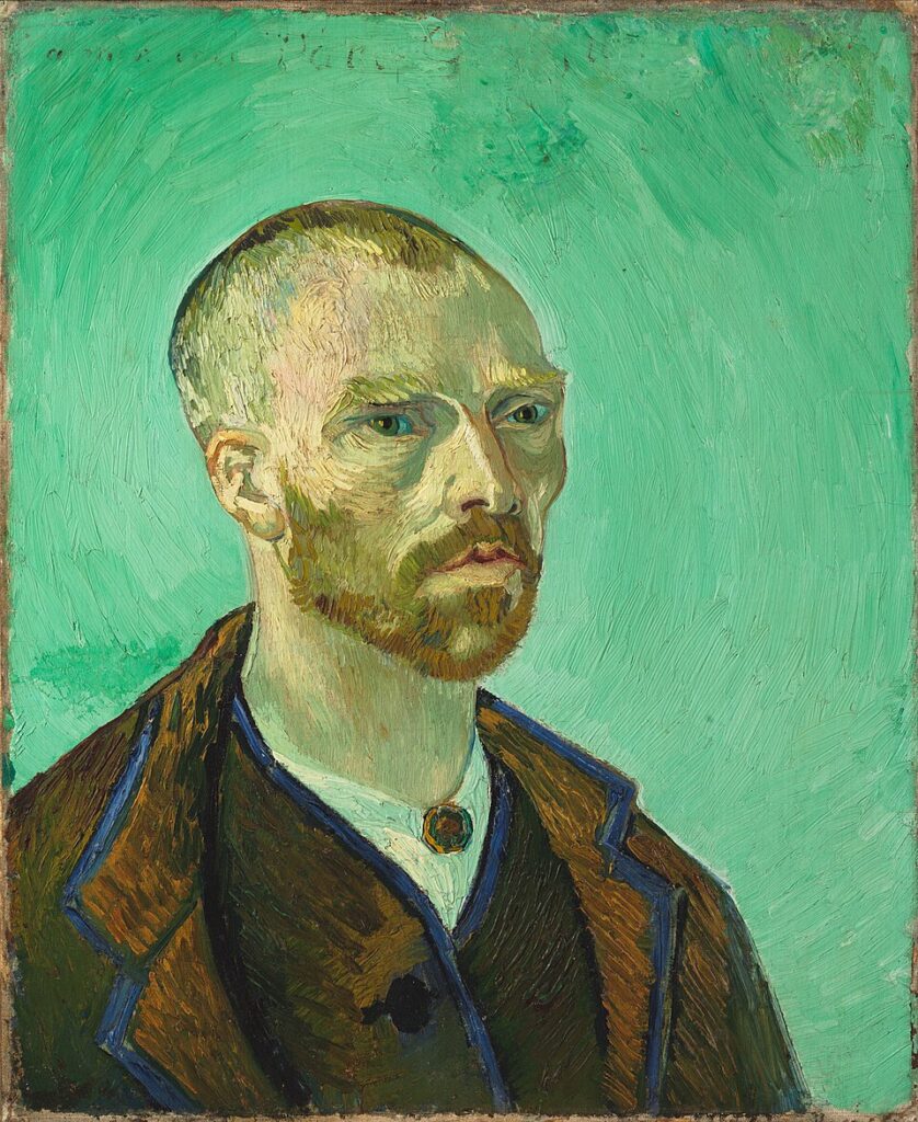
However, because of its durability and less tendency to change hue, as well as its unusual blue undertone, artists loved this shade of green. Van Gogh often did not sign his paintings, not even with the Vincent one, but he was very fond of dedicating self-portraits, including the one without an ear, to Paul Gauguin. So he dedicated this self-portrait to him, which is saturated with precisely that thickly applied Parisian green:
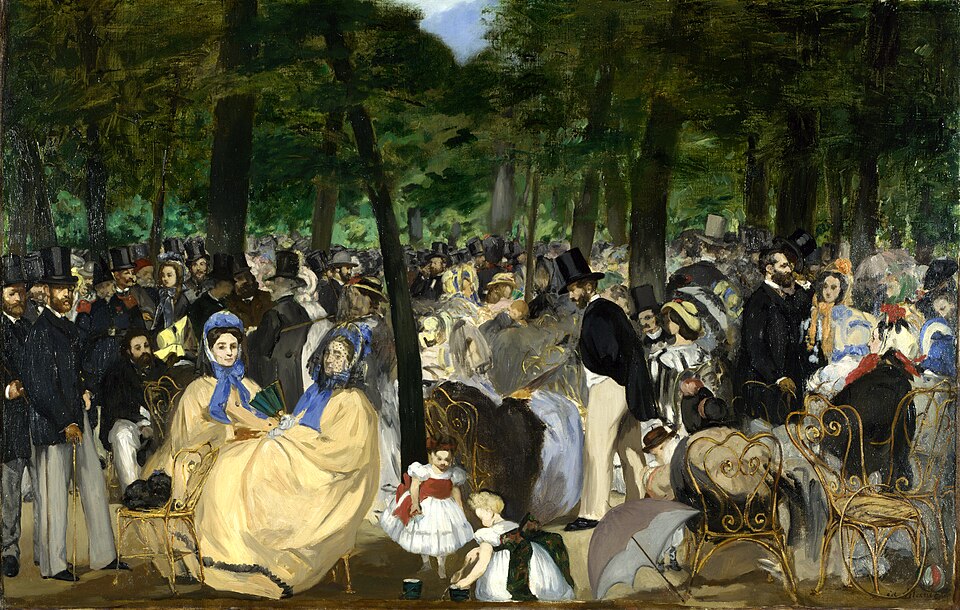
The era of impressionism and post-impressionism was the era of color-hungry artists, after a period in which earthy colors prevailed, and yellows, blues and greens were used sparingly. However, advances in chemical synthesis have made many colors and shades more accessible, even at the cost of toxicity. This was a shade that Paul Cézanne loved and it was confirmed on his Fruit Basket, and it was also used by Édouard Manet, for example on La Musique aux Tuileries.
The dye was so popular that, with all its arsenic, it was used for book covers, for dyeing textiles on covers and for book ends, as well as for printed or handmade illustrations and for wallpaper.
The Poison Book Project is a joint initiative of the Winterthur Museum, Garden and Library and the University of Delaware, whose goal is to identify and catalog books that contain poisonous substances, especially arsenic in Paris green. The project was launched in 2019, after employees of the Winterthur Museum, Melissa Tedone and Rosie Grayburn, discovered a book in the museum's collection, the cover of which was painted with a pigment containing arsenic. It is a Parisian green color, which was used in the past to decorate book covers.
The discovery triggered a systematic research of old book collections. So far, at least another 100 books found in libraries around the world have been confirmed to contain this toxic pigment. Thanks to the project, libraries can identify potentially dangerous items and take appropriate protective measures to reduce the risk of exposure to toxic substances for librarians, researchers and other people who come into contact with the books.
Wallpaper samples from the 19th century are preserved in the book Shadows from the Walls of Death by the American physician Robert C. Kedziej, which is known for containing examples of wallpaper painted with arsenic-based pigments. Robert C. Kedzie published it to warn the public about the health risks of using such wallpaper in homes.
Today, fortunately, we can achieve the same shades without toxic components. The most important substitute belongs to the group of phthalocyanine green pigments. But the story of Paris green is the story of the toxic properties of arsenic compounds, of public health and the development of safety measures for the things we use, but also the story of green as the color of hope and a color toxic to the Nazis.
Jelena Kalinić, graduate biologist, MA comparative literature, publicist, scitech, health journalist, journalist and scientific communicator, holds a WHO infodemic manager certificate and Health metrics Study design & Evidence based medicine training. Second place in the selection for European Science journalist of the year for 2022. Internews Health Journalism Ambassador for 2022. BIRN Fellowship- Digital/AI rights. Especially interested in healthcare, the relationship between science, democracy and society and the impact of technology such as AI on society and AI ethics. In 2015, she founded the scientific blog Quantum of Science, which was rebranded as Science Speaks in 2023. The founder and editor and main author of Nauka govori and the host and editor of the Nauka govori podcast and Instagram and FB profile Nauka govori. In 2018, she also founded a website for information about vaccines, Vakcine.ba.